Grid System Guide
Grid System
Grid system includes a responsive, mobile first grid system that appropriately scales up to 12 columns as the device or viewport size increases. It includes predefined classed for easy layout options
- Use rows
.rowto create horizontal groups of columns. - Predefined grid classes like
.rowand.col-sm-4are available for quickly making grid layouts. - Grid columns are created by specifying the number of twelve available columns you wish to span. For example, three equal columns would use three
divtag with class.col-sm-4 - Grid class apply tho device with screen widths greater than or equal to the breakpoint size and override grid class targeted at smaller devices.
Look to the examples for applying these principles to your code.
Grid Option
We use the following breakpoints in our CSS files to create the key breakpoints in our grid system.
- Portrait Phones
screen-width <480px - Landscape Phones
screen-width >=480px - Small devices (tablets)
screen-width >=768px - Medium/Large devices (desktops)
screen-width >=1024px
Please see how aspects of the grid system work across multiple devices with a handy table.
| Portrait Phones Portrait Phones (<480px) | Landscape Phones Landscape Phones (>=480px) | Small devices Tablets (>=768px) | Medium/Large devices Desktops (>=1024px) | |
|---|---|---|---|---|
| Grid Behavior | Horizontal at all times | Collapsed to start, horizontal above breakpoints | ||
| Class prefix | .col-* |
.col-sm-* |
.col-md-* |
.col-lg-* |
Example: Stacked-to-horizontal
Using a single set of .col-sm-* grid classes, you can create a basic grid system that starts out stacked on portrait mobile devices before becoming horizontal on landscape mobile, tablet and desktop devices (>= 480px). Place grid columns in any .row.
.col-sm-* implement on screen >= 480px..col-sm-1.col-sm-9 and .col-sm-3 or .col-sm-8 and .col-sm-4 or .col-sm-7 and .col-sm-5. Any couple classes are fine if the totals is 12..col-sm-8 and .col-sm-4.col-sm-4.col-sm-6<div class="row">
<div class="col-sm-1">.col-sm-1</div>
<div class="col-sm-1">.col-sm-1</div>
<div class="col-sm-1">.col-sm-1</div>
<div class="col-sm-1">.col-sm-1</div>
<div class="col-sm-1">.col-sm-1</div>
<div class="col-sm-1">.col-sm-1</div>
<div class="col-sm-1">.col-sm-1</div>
<div class="col-sm-1">.col-sm-1</div>
<div class="col-sm-1">.col-sm-1</div>
<div class="col-sm-1">.col-sm-1</div>
<div class="col-sm-1">.col-sm-1</div>
<div class="col-sm-1">.col-sm-1</div>
</div>
<div class="row">
<div class="col-sm-8">.col-sm-8</div>
<div class="col-sm-4">.col-sm-4</div>
</div>
<div class="row">
<div class="col-sm-4">.col-sm-4</div>
<div class="col-sm-4">.col-sm-4</div>
<div class="col-sm-4">.col-sm-4</div>
</div>
<div class="row">
<div class="col-sm-6">.col-sm-6</div>
<div class="col-sm-6">.col-sm-6</div>
</div>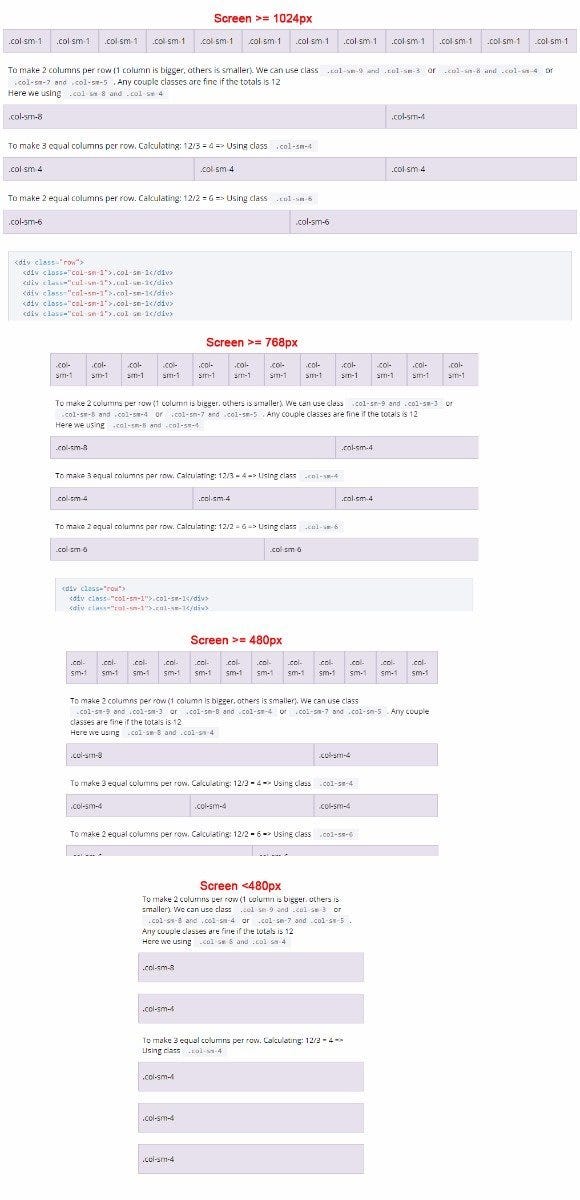
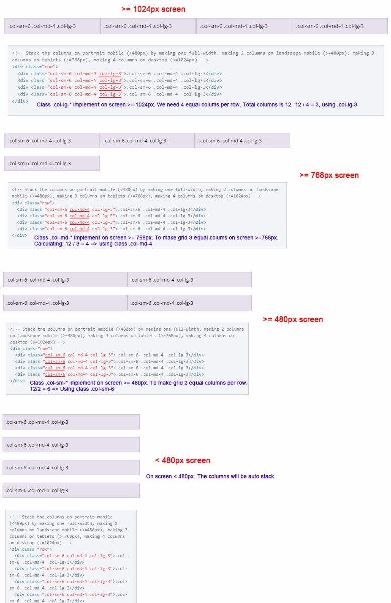
Example: Mobile, Tablet, Desktop
Don't want your columns to simply stack in smaller devices? Use the extra medium and large device grid classes by adding .col-md-* .col-lg-* to your columns. See the example below for a better idea of how it all works.
- Making 4 columns when screen width >= 1024px.
- Making 3 columns when screen width >= 768px
- Making 2 columns when screen width >= 480px
- Stacked the columns by making one full-width when screen width < 480px
<!-- Stack the columns on portrait mobile (<480px) by making one full-width, making 2 columns on landscape mobile (>=480px), making 3 columns on tablets (>=768px), making 4 columns on desktop (>=1024px) -->
<div class="row">
  <div class="col-sm-6 col-md-4 col-lg-3">.col-sm-6 .col-md-4 .col-lg-3</div>
  <div class="col-sm-6 col-md-4 col-lg-3">.col-sm-6 .col-md-4 .col-lg-3</div>
  <div class="col-sm-6 col-md-4 col-lg-3">.col-sm-6 .col-md-4 .col-lg-3</div>
  <div class="col-sm-6 col-md-4 col-lg-3">.col-sm-6 .col-md-4 .col-lg-3</div>
</div>
Example: Mobile and Desktop
Build on the previous example by creating even more dynamic and powerful layouts.
	<!-- Columns start at 50% wide on mobile and bump up to 33.3% wide on desktop -->
<div class="row">
  <div class="col-6 col-lg-4">.col-6 .col-lg-4</div>
  <div class="col-6 col-lg-4">.col-6 .col-lg-4</div>
  <div class="col-6 col-lg-4">.col-6 .col-lg-4</div>
</div>

	<!-- Columns start at 50% wide on mobile and bump up to 66.6% and 33.3% wide on desktop -->
<div class="row">
  <div class="col-6 col-lg-8">.col-6 .col-lg-8</div>
  <div class="col-6 col-lg-4">.col-6 .col-lg-4</div>
</div>

<!-- Columns are always 50% wide, on mobile and desktop -->
<div class="row">
  <div class="col-6">.col-6</div>
  <div class="col-6">.col-6</div>
</div>
Three equal columns
Get three equal-width columns starting at tablets and scaling to desktops. On mobile devices and below, the columns will automatically stack.
Three unequal columns
Get three columns starting at desktops and scaling to large desktops of various widths. Remember, grid columns should add up to twelve for a single horizontal block. More than that, and columns start stacking no matter the viewport.
Two columns
Get two columns starting at tablets and scaling to desktops.
Mixed: mobile and desktop
Mixed: mobile, tablet, and desktop
Align Items
.align-flex-center
.align-flex-center on .rowExample:
.col-6 .col-sm-4
Centrifuges are used in pharmaceutical, biology, microbiology, manufacturing and research labs to separate and isolate suspensions, gas and immiscible liquids.
.col-6 .col-sm-4
Centrifuges can be categorized as ventilated or refrigerated centrifuges.
.col-6 .col-sm-4
Centrifuges are used in pharmaceutical, biology, microbiology, manufacturing and research labs to separate and isolate suspensions, gas and immiscible liquids. The rotating action of the centrifuge chamber creates the separation as lighter particles migrate toward the axis of centrifugal rotation while more dense particles migrate away.
	<!-- Make text on 3 columns to justify center -->
<div class="row align-flex-center">
  <div class="col-6 col-sm-4">.col-6 .col-sm-4</div>
  <div class="col-6 col-sm-4">.col-6 .col-sm-4</div>
  <div class="col-6 col-sm-4">.col-6 .col-sm-4</div>
</div>
.align-flex-end
.align-flex-end on .rowExample:
.col-6 .col-sm-4
Centrifuges are used in pharmaceutical, biology, microbiology, manufacturing and research labs to separate and isolate suspensions, gas and immiscible liquids.
.col-6 .col-sm-4
Centrifuges can be categorized as ventilated or refrigerated centrifuges.
.col-6 .col-sm-4
Centrifuges are used in pharmaceutical, biology, microbiology, manufacturing and research labs to separate and isolate suspensions, gas and immiscible liquids. The rotating action of the centrifuge chamber creates the separation as lighter particles migrate toward the axis of centrifugal rotation while more dense particles migrate away.
	<!-- Make text on 3 columns to justify bottom -->
<div class="row align-flex-end">
  <div class="col-6 col-sm-4">.col-6 .col-sm-4</div>
  <div class="col-6 col-sm-4">.col-6 .col-sm-4</div>
  <div class="col-6 col-sm-4">.col-6 .col-sm-4</div>
</div>
20.Color Class
Color Class
Using class .blue to make text color: #005978
Centrifuges are used in pharmaceutical
Using class .blue-bold to make text color: #004f6a
Centrifuges are used in pharmaceutical
Using class .accent to make text color: #71daff
Centrifuges are used in pharmaceutical
Using class .accent-bold to make text color: #6ac7e8
Centrifuges are used in pharmaceutical
Style Color Inline
<span style="color:#ff0000">Centrifuges are used in pharmaceuticalk</span>
Centrifuges are used in pharmaceutical